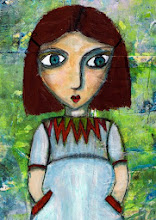
 Lorna from South Africa sent me a package of challenge goodies last week (see "Balela Buttons" below). The combination of gorgeous buttons, bright African fabric, and Lorna's location helped me pull up some ideas, root out some materials from my stash, and create this "African Notes" journal. As always, you can click on the images to see larger versions.
The cover measures just over 20 x 20 cm, the pages exactly 20x20 cm. I like the square format, because I think it invites us to play and write. Maybe that's because it's more of an album- than a book format.
For the covers I cut two squares of thick cardboard from the back of a sketch pad. Book board would have been ideal, of course, but learning how to substitute what you have for what you don't have is part of the art game.
The orange cover background is watercolour paper (180g/m2) washed with layers of yellow and orange and stuck to the card using gel medium. Gel medium is stronger than glue stick. There's less risk of the heavy watercolour paper coming loose again. Then I glued on the zebra-stripe tissue with glue stick.

The frame was part of a rooibush tea packet from Lorna. I cut out the centre using an xacto knife, stuck a scrap of the African fabric behind the frame, and mounted the result onto a scrap of corrugated card, to give it dimension. I cut a semicircle from the remaining orange background, to represent the African sun, glued it down and attached a sunny eyelet. Then I selected some of the Belala buttons as focal objects and glued them onto the assemblage (gel medium), too. The four copper buttons (painted wooden dots) were afterthoughts that I feel helped balance the section and add further dimension. The outcome was then glued to the cover.
The word definition above the frame is "brighten", which I felt suited the colours and my intention. All I did was cut a scrap of background card slightly larger than the definition, edge it with chalk pad, then stick the card to a scrap of foam board and onto the cover. The wording on its own would have been lost in all the dynamic colours and patterns, but raising it this way makes it stand out without screaming for attention. I ran a walnut distress pad (Ranger Inks) around the entire cover edge to finish it off. You could do more or less the same with dark brown paint (think burn sienna or burnt umber) and a stiff dry paintbrush.
 The inside pages (180g/m2 watercolour paper) are colored with a thin wash of yellow and buff acrylic paint. Just squirt blobs onto a plate, grab a piece of sponge, pick up the paint and swipe it onto the page. Don't mix the paint on your palette, mix it on the page as you go.
I edged all the large pages with strips cut from an African theme paper napkin. The black line drawings are packing tape transfers. I added some simple geometric hand lining, too (Pitt Artist's pen).
In between the full size pages I used page stubs to add variety and more compact illustrations. The idea is that Lorna can write or draw around the starter illustrations and can also add more pages as she chooses.
Lorna... this will be on its way to you next week.

3 comments:
Fantastic! Brilliant idea :)
hugs, Linda.
Beautiful, Susan. The rich colors and patterns of Lorna's materials are so different from what we usually see. You did them justice.
You have me "wow-ing" all the time! ;-)
Post a Comment