skip to main |
skip to sidebar
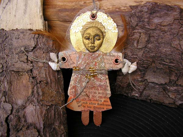
 The AlteredArtsEurope group is in the process of completing a "Trash to Treasure" swap. Most of the swappers have already received their booty. Mine arrived the other day, and I've been playing with it, adding bits and pieces to some of my little works in progress and allowing myself to be inspired by the materials to create new objects.This was a playful little doll I made today, just because... It's an Artangel, and the scraps I used from my treasure box were the star punchinella on the halo, a scrap of fabric on the dress, and a piece of skeleton leaf.Click the image to see a larger version. It really is true that one artist's project leftovers (the trash) are another person's treasure. We all have access to different things, and by swapping we help each other try out new stuff we might not have been able to find or wouldn't have thought of using.All you need to do is find at least one swap partner. Each swapper takes a shoe box and cuts a narrow slit in the lid. The idea is that you can slip stuff into the box but can't pull it out again. The lid is then taped shut. Over a period of time, the boxes fill with project leftovers (and usually also the occasional RAK). The boxes are swapped out after the agreed period. You don't miss the scraps, because you'd either have thrown them away or hidden them in a drawer in any case. They haven't' cost you loads of money. You don't have to give away good stuff from your stash. You give what you probably wouldn't use again.The usual reaction when a box arrives is the kind of joy people say they last experienced as kids at Christmas. I know I tend to find just the right scrap for...
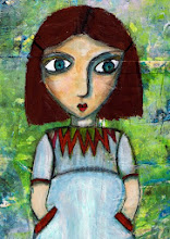
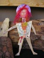 Challenge materials sent to me a while back included poem pages from Brian Andreas' book "Still Mostly True". I used one of the poems (Secret Heart) in the making of this doll. Secret Heart picks up a truism we've probably all had tossed our way at some point, about the secret being in your heart and not in your eye. (St. Exupery packaged it best of all in "The Little Prince".) I collaged the poem onto the dolls' body.Click on the images to see larger versions.
The doll gazes off into the distance. Both her faraway gaze and the space between her head and heart are intentional and underline the schism many people experience between the desire for personal authenticity and the need to bow to outward demands.
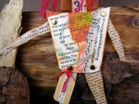 The arms and legs are covered in sheet music and vintage book text. As well as being among my favorite materials, they also help express another truism: that each of us is composed of words and music (and art and emotions and desires) that define who we are but that we can't always show, or are not always seen. Another truism? The safest place to hide something can be in full view. People rarely look at each other to see who is "at home" in a body, and they don't expect the truth to be visible.
Contemplating the doll made me wonder what would happen if we were to write our thoughts on our skin or on our clothing -- if we were to use our bodies as a changing canvas, which we do in ways, of course, but not as intentionally as I mean it. Maybe we should create a day to do just that (but for heavens sake, don't tell Hallmark).
Brian Andreas - Story People
http://www.storypeople.com/
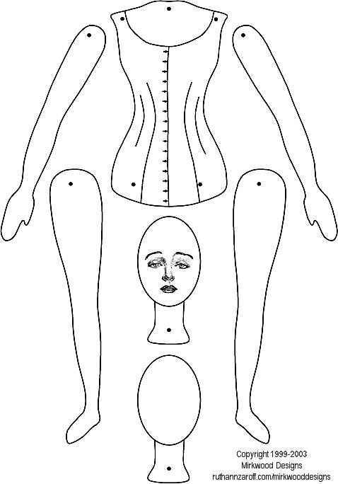
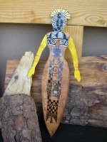 This doll is for the AlteredArtEurope September challenge. I'll send it on its way to Claire in England sometime this coming week. (As always, you can click to enlarge the photos.)I've called the doll "Spiritual Warrior". To make it simple, the back to back dolls show what's up front (though hidden behind an everyday mask) and what's behind what's up front.The foundation for the double-doll is the Mirkwood paper doll template. You can download the template at:www.ruthannzaroff.com/mirkwooddesigns/images/paperdoll.gifI enlarged the doll before printing and cutting out the parts, then used the torso as a template to draw the body of the primordial goddess doll.For the goddess, I painted the torso in four shades of blended acrylic (buff, yellow ochre, pale gold, and copper), then stamped on the spirals sign a small spiral stamp and three shades of yellow and brown inks. To complete the image, I decorated the body with various tribal transfers.
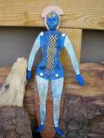 The torso on the warrior side is painted blue. I then applied a transfer and topped it with a paper tribal pattern. The legs and arms are covered in a layer of raised pattern wallpaper to give them depth and dimension. I then dry-brushed on blue and gold paint to highlight the raised elements.One of the things I like about this doll is that when it is viewed from the goddess side, the warrior is invisible, because the legs are tucked behind the torso. The warrior's arms and legs are movable, though, so she can take a firm stance.If you are an altered artist living in Europe, feel welcome to join the AlteredArtEurope group. You can use the link in the "links" section on the right of this page.
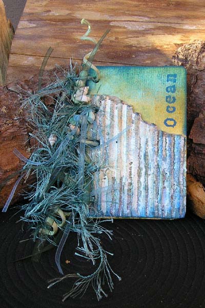
 This 12 x 8 cm journal has been awaiting assembly and embellishment for a few weeks. Yesterday I pulled it out and completed it. The journal feels like a final glimpse of summer before autumn takes over completely.
Like the Summer Journal I posted in July (link below), the covers are made of heavy card and the pages of 180g watercolour paper. The basic colours are blue-greens.
The cover embellishment is a scrap of corrugated cardboard covered with gesso and then painted in various sea colours. I used watercolour crayons and touches of Lumiere. The photos don't show it too well, but it has the weatherbeaten look of wood that has been subjected to the elements.
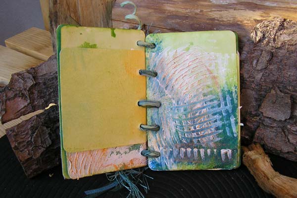
After painting the pages, I also applied dashed of gesso and spread it thinly and randomly with a serrated spatula. The white of the gesso suggests sea spray or coral formations, the original page colour shows through in places on each page, thus binding the gesso visually to the page, and I've also added strokes of sea colours here and there to add depth in some places. The ridges are highlighted with gold to suggest sunlight on the water.
 I bound the journal by running pale green paper-covered wire, transparent ribbon, sea-green feathered yarn, and a length of emerald green effect wire through holes I punched with a setting tool. I looped the binding loosely, so the journal can be opened flat to write entries. A few tiny shells strung onto the wire round the binding off.
July Summer Journal
http://artangelix.blogspot.com/2006/07/summer-journal.html
 I've been working with tiny scraps and leftovers for the past day or two. Then I came across a tiny matchbox I was given as an advertising gag a couple of years ago, and I decided to make an amulet. It's about domino size. The matchbox is covered and then smeared with embossing ink and dipped in clear embossing powder. While the powder was still hot, I dipped on another layer and heated that too. The box is covered in around six layers of melted powder, which gives it a deeply lacquered look, quite unlike paper, now.
 After I completed the African Journal for Lorna (below), I started work on three smaller African theme journals. This one measures 12 x 6 cm (4,5 x 2 inches). Though it may be small, it's no less detailed than its larger counterpart. Each of the pages is tinted and edged and contains an African image.
 Tip: If you want to colour small surfaces like the pages of this journal, try swiping an ink pad directly onto the page. You can achieve different effects, depending on whether you hold the paper in your hand or lay it on a flat surface. For even more variety, try patting swiping, swirling, working lightly or firmly. Try using two colours or three.
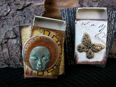
 I'm mulling over an idea for an extensive prayer box project, and these are a couple of the try outs I did. If I go ahead with the project I'll need more than one hundred individual objects, so I'm experimenting now with a view to choosing materials and techniques that are not too expensive and won't take an eternity to carry out.
Experimenting is important. Not all experiments work out, and not all work out in their entirety, but some do, which is nice, and you can also make serendipitous discoveries in your failures. I know I do. That was the case with these boxes. I was trying out a halo approach, in which the result didn't suit my taste, but in doing so, the slip of a Pitt pen and my attempt at correcting it led me to the verdigris you can see on the face. Now, that I liked a lot!
I also experimented with painting, stamping, and embossing background boards. These are abachi wood (inexpensive but apparently not available where I live), which I like to use, but I also have a series of balsa (cheaper, lighter, slightly easier to obtain) tests in various states of preparation. The board behind the box on the left is unpainted, and the board behind the box on the right is painted black and stamped and embossed in gold.
When I'm through, I'll know which combinations of materials and approaches I want to use, which will save me time in the execution of the larger project. But the experiments are anything other than wasted time: I'll jazz them up a little, and they'll make lovely eyecatchers and raks.
 Lorna from South Africa sent me a package of challenge goodies last week (see "Balela Buttons" below). The combination of gorgeous buttons, bright African fabric, and Lorna's location helped me pull up some ideas, root out some materials from my stash, and create this "African Notes" journal. As always, you can click on the images to see larger versions.
The cover measures just over 20 x 20 cm, the pages exactly 20x20 cm. I like the square format, because I think it invites us to play and write. Maybe that's because it's more of an album- than a book format.For the covers I cut two squares of thick cardboard from the back of a sketch pad. Book board would have been ideal, of course, but learning how to substitute what you have for what you don't have is part of the art game.The orange cover background is watercolour paper (180g/m2) washed with layers of yellow and orange and stuck to the card using gel medium. Gel medium is stronger than glue stick. There's less risk of the heavy watercolour paper coming loose again. Then I glued on the zebra-stripe tissue with glue stick.  The frame was part of a rooibush tea packet from Lorna. I cut out the centre using an xacto knife, stuck a scrap of the African fabric behind the frame, and mounted the result onto a scrap of corrugated card, to give it dimension. I cut a semicircle from the remaining orange background, to represent the African sun, glued it down and attached a sunny eyelet. Then I selected some of the Belala buttons as focal objects and glued them onto the assemblage (gel medium), too. The four copper buttons (painted wooden dots) were afterthoughts that I feel helped balance the section and add further dimension. The outcome was then glued to the cover.The word definition above the frame is "brighten", which I felt suited the colours and my intention. All I did was cut a scrap of background card slightly larger than the definition, edge it with chalk pad, then stick the card to a scrap of foam board and onto the cover. The wording on its own would have been lost in all the dynamic colours and patterns, but raising it this way makes it stand out without screaming for attention. I ran a walnut distress pad (Ranger Inks) around the entire cover edge to finish it off. You could do more or less the same with dark brown paint (think burn sienna or burnt umber) and a stiff dry paintbrush.
 The inside pages (180g/m2 watercolour paper) are colored with a thin wash of yellow and buff acrylic paint. Just squirt blobs onto a plate, grab a piece of sponge, pick up the paint and swipe it onto the page. Don't mix the paint on your palette, mix it on the page as you go.I edged all the large pages with strips cut from an African theme paper napkin. The black line drawings are packing tape transfers. I added some simple geometric hand lining, too (Pitt Artist's pen).In between the full size pages I used page stubs to add variety and more compact illustrations. The idea is that Lorna can write or draw around the starter illustrations and can also add more pages as she chooses.
Lorna... this will be on its way to you next week.
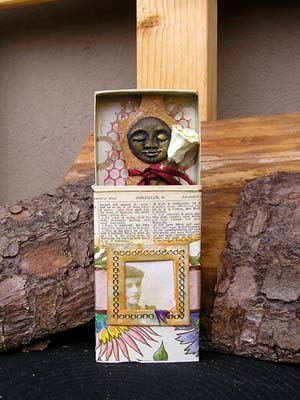
 This is one of a series of "Prayerbox" objects I have on my workbench this week. The "prayers" are not strictly the religious kind but reflect some of the spiritual needs people have in other ways. This one stems from my thoughts on the link between spirituality and beautiful things.
The matchboxes I'm using for this project measure 11 x 6 x 2 cm and are therefore larger than standard boxes.
This box is covered with a scrap of thin floral design paper and part of a page from an old Bible, sent to me in a challenge materials package. The front is embellished with a strip of colour co-ordinated satin ribbon and a small paper frame around an image (colour copy) from my cabinet card collection.
I covered the inside of the drawer with a scrap of ivory paper with a gold scroll pattern. The basis of the object in side the box is a torso. One side -- the side you can see -- is covered in scraps of bodhi leaf painted gold.
The goddess face is black and gold, the paper flower white, and the band around the torso red. Together these colours represent the ancient three-fold goddess.
The back of the torso is covered in a scrap of vintage advertisement. I sandwiched a scrap of punchinella in between layers to suggest wings.
A very basic interpretation of the piece is that the ancient goddess, the vintage girl, and the modern day artist/owner share the same delight in loveliness.
 The AlteredArtsEurope group is in the process of completing a "Trash to Treasure" swap. Most of the swappers have already received their booty. Mine arrived the other day, and I've been playing with it, adding bits and pieces to some of my little works in progress and allowing myself to be inspired by the materials to create new objects.


