Friday, September 29, 2006

Secret Heart Poem Doll

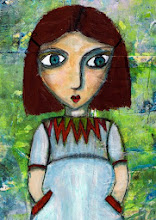
Challenge materials sent to me a while back included poem pages from Brian Andreas' book "Still Mostly True". I used one of the poems (Secret Heart) in the making of this doll.

Secret Heart picks up a truism we've probably all had tossed our way at some point, about the secret being in your heart and not in your eye. (St. Exupery packaged it best of all in "The Little Prince".) I collaged the poem onto the dolls' body.

Click on the images to see larger versions.

The doll gazes off into the distance. Both her faraway gaze and the space between her head and heart are intentional and underline the schism many people experience between the desire for personal authenticity and the need to bow to outward demands.
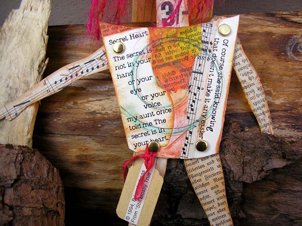
The arms and legs are covered in sheet music and vintage book text. As well as being among my favorite materials, they also help express another truism: that each of us is composed of words and music (and art and emotions and desires) that define who we are but that we can't always show, or are not always seen. Another truism? The safest place to hide something can be in full view. People rarely look at each other to see who is "at home" in a body, and they don't expect the truth to be visible.

Contemplating the doll made me wonder what would happen if we were to write our thoughts on our skin or on our clothing -- if we were to use our bodies as a changing canvas, which we do in ways, of course, but not as intentionally as I mean it. Maybe we should create a day to do just that (but for heavens sake, don't tell Hallmark).

Brian Andreas - Story People
http://www.storypeople.com/


Saturday, September 23, 2006

Spiritual Warrior

This doll is for the AlteredArtEurope September challenge. I'll send it on its way to Claire in England sometime this coming week. (As always, you can click to enlarge the photos.)

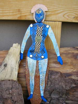
I've called the doll "Spiritual Warrior". To make it simple, the back to back dolls show what's up front (though hidden behind an everyday mask) and what's behind what's up front.

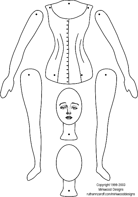
The foundation for the double-doll is the Mirkwood paper doll template. You can download the template at:

www.ruthannzaroff.com/mirkwooddesigns/images/paperdoll.gif

I enlarged the doll before printing and cutting out the parts, then used the torso as a template to draw the body of the primordial goddess doll.

For the goddess, I painted the torso in four shades of blended acrylic (buff, yellow ochre, pale gold, and copper), then stamped on the spirals sign a small spiral stamp and three shades of yellow and brown inks. To complete the image, I decorated the body with various tribal transfers.

The torso on the warrior side is painted blue. I then applied a transfer and topped it with a paper tribal pattern. The legs and arms are covered in a layer of raised pattern wallpaper to give them depth and dimension. I then dry-brushed on blue and gold paint to highlight the raised elements.

One of the things I like about this doll is that when it is viewed from the goddess side, the warrior is invisible, because the legs are tucked behind the torso. The warrior's arms and legs are movable, though, so she can take a firm stance.

If you are an altered artist living in Europe, feel welcome to join the AlteredArtEurope group. You can use the link in the "links" section on the right of this page.

Monday, September 11, 2006

Ocean Journal


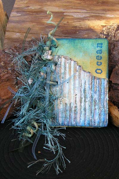
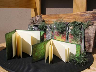
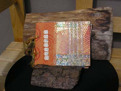
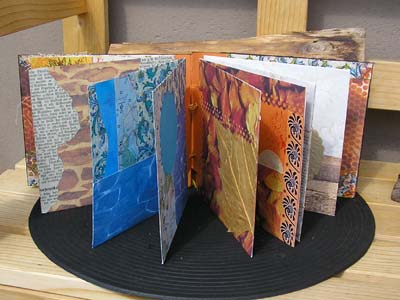
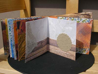
This 12 x 8 cm journal has been awaiting assembly and embellishment for a few weeks. Yesterday I pulled it out and completed it. The journal feels like a final glimpse of summer before autumn takes over completely.

Like the Summer Journal I posted in July (link below), the covers are made of heavy card and the pages of 180g watercolour paper. The basic colours are blue-greens.

The cover embellishment is a scrap of corrugated cardboard covered with gesso and then painted in various sea colours. I used watercolour crayons and touches of Lumiere. The photos don't show it too well, but it has the weatherbeaten look of wood that has been subjected to the elements.

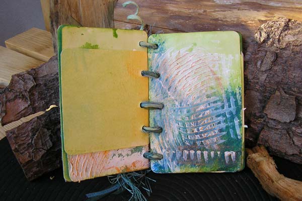
After painting the pages, I also applied dashed of gesso and spread it thinly and randomly with a serrated spatula. The white of the gesso suggests sea spray or coral formations, the original page colour shows through in places on each page, thus binding the gesso visually to the page, and I've also added strokes of sea colours here and there to add depth in some places. The ridges are highlighted with gold to suggest sunlight on the water.

I bound the journal by running pale green paper-covered wire, transparent ribbon, sea-green feathered yarn, and a length of emerald green effect wire through holes I punched with a setting tool. I looped the binding loosely, so the journal can be opened flat to write entries. A few tiny shells strung onto the wire round the binding off.

July Summer Journal
http://artangelix.blogspot.com/2006/07/summer-journal.html

Thursday, September 07, 2006

Amulet

I've been working with tiny scraps and leftovers for the past day or two. Then I came across a tiny matchbox I was given as an advertising gag a couple of years ago, and I decided to make an amulet. It's about domino size. The matchbox is covered and then smeared with embossing ink and dipped in clear embossing powder. While the powder was still hot, I dipped on another layer and heated that too. The box is covered in around six layers of melted powder, which gives it a deeply lacquered look, quite unlike paper, now.

Africa Again

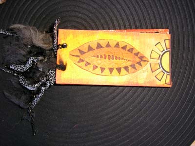
After I completed the African Journal for Lorna (below), I started work on three smaller African theme journals. This one measures 12 x 6 cm (4,5 x 2 inches). Though it may be small, it's no less detailed than its larger counterpart. Each of the pages is tinted and edged and contains an African image.

Tip: If you want to colour small surfaces like the pages of this journal, try swiping an ink pad directly onto the page. You can achieve different effects, depending on whether you hold the paper in your hand or lay it on a flat surface. For even more variety, try patting swiping, swirling, working lightly or firmly. Try using two colours or three.

Tuesday, September 05, 2006

Prayer Boxes

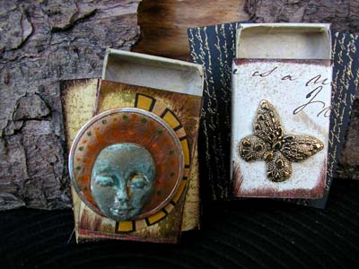
I'm mulling over an idea for an extensive prayer box project, and these are a couple of the try outs I did. If I go ahead with the project I'll need more than one hundred individual objects, so I'm experimenting now with a view to choosing materials and techniques that are not too expensive and won't take an eternity to carry out.

Experimenting is important. Not all experiments work out, and not all work out in their entirety, but some do, which is nice, and you can also make serendipitous discoveries in your failures. I know I do. That was the case with these boxes. I was trying out a halo approach, in which the result didn't suit my taste, but in doing so, the slip of a Pitt pen and my attempt at correcting it led me to the verdigris you can see on the face. Now, that I liked a lot!

I also experimented with painting, stamping, and embossing background boards. These are abachi wood (inexpensive but apparently not available where I live), which I like to use, but I also have a series of balsa (cheaper, lighter, slightly easier to obtain) tests in various states of preparation. The board behind the box on the left is unpainted, and the board behind the box on the right is painted black and stamped and embossed in gold.

When I'm through, I'll know which combinations of materials and approaches I want to use, which will save me time in the execution of the larger project. But the experiments are anything other than wasted time: I'll jazz them up a little, and they'll make lovely eyecatchers and raks.

Sunday, September 03, 2006

African Notes

Lorna from South Africa sent me a package of challenge goodies last week (see "Balela Buttons" below). The combination of gorgeous buttons, bright African fabric, and Lorna's location helped me pull up some ideas, root out some materials from my stash, and create this "African Notes" journal. As always, you can click on the images to see larger versions.

The cover measures just over 20 x 20 cm, the pages exactly 20x20 cm. I like the square format, because I think it invites us to play and write. Maybe that's because it's more of an album- than a book format.

For the covers I cut two squares of thick cardboard from the back of a sketch pad. Book board would have been ideal, of course, but learning how to substitute what you have for what you don't have is part of the art game.

The orange cover background is watercolour paper (180g/m2) washed with layers of yellow and orange and stuck to the card using gel medium. Gel medium is stronger than glue stick. There's less risk of the heavy watercolour paper coming loose again. Then I glued on the zebra-stripe tissue with glue stick.

The frame was part of a rooibush tea packet from Lorna. I cut out the centre using an xacto knife, stuck a scrap of the African fabric behind the frame, and mounted the result onto a scrap of corrugated card, to give it dimension. I cut a semicircle from the remaining orange background, to represent the African sun, glued it down and attached a sunny eyelet. Then I selected some of the Belala buttons as focal objects and glued them onto the assemblage (gel medium), too. The four copper buttons (painted wooden dots) were afterthoughts that I feel helped balance the section and add further dimension. The outcome was then glued to the cover.

The word definition above the frame is "brighten", which I felt suited the colours and my intention. All I did was cut a scrap of background card slightly larger than the definition, edge it with chalk pad, then stick the card to a scrap of foam board and onto the cover. The wording on its own would have been lost in all the dynamic colours and patterns, but raising it this way makes it stand out without screaming for attention. I ran a walnut distress pad (Ranger Inks) around the entire cover edge to finish it off. You could do more or less the same with dark brown paint (think burn sienna or burnt umber) and a stiff dry paintbrush.

The inside pages (180g/m2 watercolour paper) are colored with a thin wash of yellow and buff acrylic paint. Just squirt blobs onto a plate, grab a piece of sponge, pick up the paint and swipe it onto the page. Don't mix the paint on your palette, mix it on the page as you go.

I edged all the large pages with strips cut from an African theme paper napkin. The black line drawings are packing tape transfers. I added some simple geometric hand lining, too (Pitt Artist's pen).

In between the full size pages I used page stubs to add variety and more compact illustrations. The idea is that Lorna can write or draw around the starter illustrations and can also add more pages as she chooses.
Lorna... this will be on its way to you next week.

Friday, September 01, 2006

Prayerbox

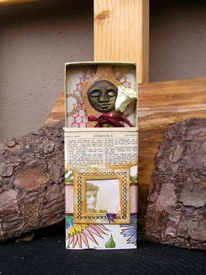
This is one of a series of "Prayerbox" objects I have on my workbench this week. The "prayers" are not strictly the religious kind but reflect some of the spiritual needs people have in other ways. This one stems from my thoughts on the link between spirituality and beautiful things.

The matchboxes I'm using for this project measure 11 x 6 x 2 cm and are therefore larger than standard boxes.


This box is covered with a scrap of thin floral design paper and part of a page from an old Bible, sent to me in a challenge materials package. The front is embellished with a strip of colour co-ordinated satin ribbon and a small paper frame around an image (colour copy) from my cabinet card collection.


I covered the inside of the drawer with a scrap of ivory paper with a gold scroll pattern. The basis of the object in side the box is a torso. One side -- the side you can see -- is covered in scraps of bodhi leaf painted gold.

The goddess face is black and gold, the paper flower white, and the band around the torso red. Together these colours represent the ancient three-fold goddess.

The back of the torso is covered in a scrap of vintage advertisement. I sandwiched a scrap of punchinella in between layers to suggest wings.

A very basic interpretation of the piece is that the ancient goddess, the vintage girl, and the modern day artist/owner share the same delight in loveliness.

Tuesday, August 29, 2006

Box of Secrets

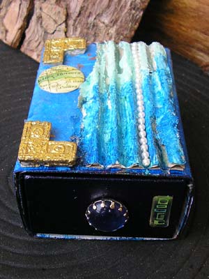
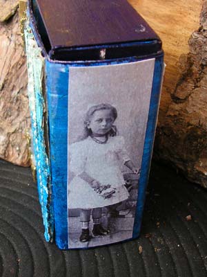
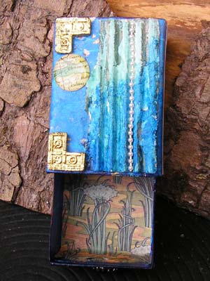
Art doesn't have to be big. This is an example of something you can do with a matchbox. It's the same size as a regular matchbox, but just a little deeper.

Start by painting the outside of both the drawer and slip cover. I used two shades of acrylic: dark for the drawer and lighter for the cover.

Line the drawer with a scrap of nice paper. Make a knob by poking through a paper fastener (brad) or a decorative stud. You can also sew on a button and attack a length fibre as a pull, or you might prefer to punch a finger-size hole instead.


I decorated this box with leftovers from other projects: a scrapsheet image, a transfer sheet postage stamp, a couple of real postage stamps. I also used a scrap of corrugated paper, painted on gesso, added a swipe of acrylic paint, and stuck on a strand of tiny fake pearls. The gold elements are something I salvaged from a cheap paper mache treasure chest a while back.

This is small and it was inexpensive to make, but even so, it's the kind of beautiful little gift you can give to your friends and know they'll appreciate it. And it's just perfect for those tiny summer treasures.

Monday, August 28, 2006

Torso Tags

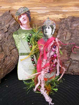
These three ladies are among the many small items I worked on in minutes scraped together here and there over the weekend.

The green lady is already packaged up and ready to embark on a flight to the USA later today. Her companion, the red lady, will remain with me. The royal lady with the legs (below) will also be making a journey soon, as a RAK for one of the artists in my Mini-Journal project.

I'm often asked where I find the time to do so much art. Well... come in closer and I'll tell you. Here's the "secret": you don't find time, you make it. My day has 1.440 minutes, just like yours, and just like everyone else's, and the only difference is in how I manage them. You can be just as productive as you think I am, if you are prepared to claim your time and use it to your advantage and if you're ready to make choices. For example, a lot of art is about waiting for things to dry, or about piecing collage elements together on a trial basis and waiting for them to say "yes" or "no" to you, and other stuff like that. So, while your art projects are bonding and jelling, you can get on with other tasks.

I'm also lucky in that I can leave some of my projects lying out on the workbench, ready for when I have a few minutes to take a next step. But before you start with "yes, well my situation is more difficult because of kids, pets, husband, space, or whatever...", you also need to know that I work with and around restrictions, too. I just make choices that differ from other people's. For example, space-wise I work in what other people would call a kitchen. Me? I just cook in my workshop from time to time.

Here's an article I wrote about making time for what matters to you. The article is written for would-be writers, but it applies equally to artists.

Make Time to Write!
http://www.inspired2write.com/sjl/sjl9.html

Sunday, August 27, 2006

Making Journal Pockets

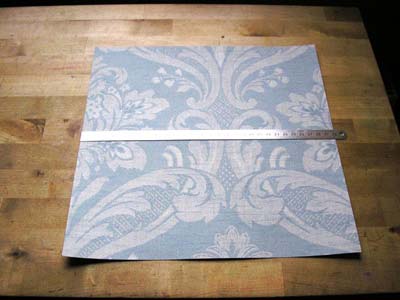
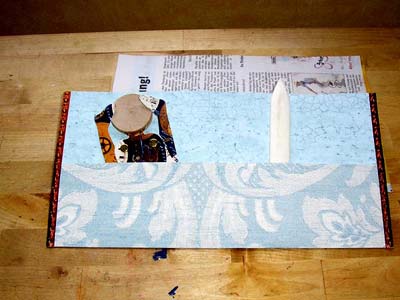
I've received a lot of email asking me about what's involved in making these pockets. Actually, they couldn't be quicker or easier to make. Here are a few photos that illustrate the process.

Take a 30 x 30 cm (or 12 x 12 inch) square of sturdy paper. The background papers sold for scrapbooking are fine, and you won't even need to cut them to size.


In this example I've used a sheet of wallpaper cut from a sample book and trimmed to size.
  • Fold the paper in half top to bottom, open it up flat again.
  • Fold the paper in half left to right, open it up again.
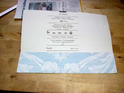
  • Fold the bottom edge to the horizontal fold line across the centre of the paper. Crease the new fold.
  • Open the flap you've just created. Smear on some glue, close the flap again, and press it until the glue is dry.
  • Fold the glued flap up at the fold line, and hey presto, you have a pocket.

Fix the pocket in place using double-sided sticky tape and/or brads, eyelets, stitching, staples, etc.

Then all you need to do is fold the pocket left edge to right edge and crease, and you have a booklet or card.

You can then decorate and fill the pocket as you wish. Make as many pockets as you need, whenever you need them. Use one pocket on its own as a card, or punch holes/stick on tabs and string the pockets together to make a book you can add to as you go.

Balela buttons

I received some challenge materials from Lorna Oosthuizen in South Africa yesterday. Among her materials were some lovely South African postage stamps, a square of sunny, ethnic look fabric, some rooibush tea packets and... a selection of the most lovely handmade buttons I've seen. They are called Balela buttons and are handcrafted, hand painted ceramic and earthenware novelty buttons.


Along with the buttons came a card that explains the meaning of Balela. Balela is an African Xhosa word which means to "shine clear as the sun from an unclouded sky". Well, the buttons certainly do that! Each one is handcrafted from clay, painted, then fired at stoneware temperatures to make them strong enough to use on clothing.


What I can tell you is that each of the buttons in front of me is an exquisite work of art.

Friday, August 25, 2006

Pocket Journal

Just one photo of this for now. I'll post more and also a longer message about it tomorrow.

All I'll say about the book today is that it will soon be on its way to Kathy, along with something else I've almost completed.

Same time, same place...

Moi (me)

Sometimes I get annoyed with myself, because I have baggies and baggies that contain little scraps of paper and stuff and small images. From time to time I want to chuck them out, but I don't (though I do give some away), because I know...

.. that now and then the scraps will come together to create something small and pleasing, like today's offering, "moi."

Why "moi"? Well, it was one of the few words I was able to put together from the letters remaining on the sheet. It also fits, because the lady on the front appears to be pointing at herself.

The print and the ladies used in this mini tag-bookie were from the decoration Gena did on the front of the box in which she packaged her materials. The beige paper was a little piece from her mix. All I added were some leftover typewriter key stickers, the filling paper, and a few inches of fibre.

Tuesday, August 22, 2006

Xmas Tags

Still on the topic of background papers... What do you think when you see images of fir cones and conifer branches in closeup? Me too. So I dug into my stash and pulled out some plain green card, painted watercolour paper, and paper napkins with a simple "Merry Christmas" message.

Using the same technique described below in the Tag-Bookies post, I cut four strips from each 12x12-inch (30x30 cm) background paper, folded the strips into tag booklets, snipped the corners and punched a hole in the flap and presto! Then I stamped the inside surface, cut card or paper to write on, and pamphlet stitched the cards/booklets into the cover.

To decorate the outside cover, which I did on one side only, I cut the painted watercolour paper slightly smaller than the tag and potched on a piece of "Merry Christmas" paper napkin. Art potch becomes semi-transparent when it dries, allowing a hint of colour from the underground to show through, and that brings a touch of subtlety to the shading of the top layer.

After trimming the napkin layer, I cut an every-so-slightly larger mat from the plain green card and layered mat and napkin onto the tag booklet.

This is a quick and easy project that you can also budget as desired. If you start now, you'll be able to make all the tag booklets you need for the holidays. There's still plenty of time to use each booklet as an art journal or "appreciation book" or "let me count the ways I love thee" in its own right and create a truly personal arty gift for each recipient.

Monday, August 21, 2006

Seasons Journal

What do you do when faced with a challenge? My approach is to do triage, then tackle the most urgent part first. When working with challenge materials, that usually means sorting through to see what will be easy to use on its own (easy, so do it last), what might have promise when combined with other materials (let ideas simmer for a day or two), and then taking a look at the remaining stuff, which is almost always tricky in some respect (do it first).

Yesterday I did triage on a set of materials and was left with several 12x12 inch background papers in the "tricky "pile. The papers were difficult for a couple of reasons. They were photographs of real items from the environment: leaves, branches, bricks, water, and so forth. One issue that presents itself with material like this is that real-life images are often overwhelming because of their size, colours, and clarity, which makes it difficult to do much by way of subtle work with them. They dominate almost anything you might want to do and tend to dictate what follows. For example, it's hard not to use beach holiday photos against a background of sun ripples on clear blue water, and autumn leaves bring along a heavy set of associations, too. Which brings in the second main issue: the photographic style is more what a scrapbooker would use, rather than an artist. So, it was clear to me that I wanted to work on the papers first, so they wouldn't sit around looking at me for days or weeks.

One of my first ideas was to cut them into cover papers or clothing for paper dolls, but that would have meant making a lot of dolls, and some of the patterns were also too large to look good on small objects. A smaller problem was that the papers had been folded, which meant they were creased, so I couldn't use them for all the ideas I brainstormed. Another idea I came up with and rejected was to cover parts of the paper(s) with gesso and then paint the gesso or use art potch to cover gesso and/or paper with paper napkins. That would have added colour, texture, and more pattern to the papers, to counteract the dominance. However, that would still have left the question of what to do with the papers after that.

A couple of ideas later I decided to use several of the papers as pocket pages in a journal. (I'd actually hoped to make something other than a journal yesterday, and I did, but more on that later.) I cut a strip from each square, which left me with pockets (the paper was already folded). Then I collaged other papers and ephemera onto the backgrounds, which made them a little more subdued and added an arty touch. The journal is an "art start", and it will be easy for the recipient to add her own touches with more papers, gesso, paint, photos, hand-made booklets or tags, and whatever else she has to hand. The covers are collaged, too, and here I added some inking and a band of woven jute.

The book still has a lot of handling ahead, when it reaches its recipient, so I decided to make the binding easy to take apart and reassemble. To do that I added a tab to the outside fold of each pocket and to the covers, reinforced them with eyelets, and threaded through some colour-coordinated fibres.

Saturday, August 19, 2006

Mini Tag-bookies

If you ever need a nice gift tag in a hurry, try making some of these mini tag-bookies. They look great, and they are incredibly quick and easy to make from whatever scraps you have lying around.

Take a baggage label/shipping tag. I used 12 x 6 cm (which is around 5 x 2.5 inches), and I wouldn't recommend anything smaller than that, really, or else it gets too fiddly. You can use larger tags though, if you have them. If you don't have tags, simply cut a piece of card to tag size, trim off the corners and punch a hole at one end.


Lay the tag in front of you with the end with the hole to the left, long edge at the top and bottom. Score and fold the tag just to the right of the hole, so you have a little flap with a hole in it. Measure the rest of the tag, from the score line to the right edge, and score another line at the halfway point. Fold the tag. You'll now have a little booklet.


My tag was 12cm long. I scored and folded 2cm from the left edge, just to the right of the hole. That left me with 10cm of tag. I scored again at 5cm and folded the booklet.


Time to do the background. Open out your booklet and lay it flat again. I filled in the backgrounds by stamping the tags on both sides then overstamping with the same stamp but a different colour of ink. Between the two colours of ink and the two or three increasingly lighter impressions you can get from one ink-up, that's a lot of shading and variety, and makes for impressive visual effects. I finished off by running a chalk ink pad around the edges. This is such a small, fast step, but it makes one heck of a difference to the appearance of an item.

The next step is to make a card or signature for the inside of the booklet, so you have something to write on. Cut some paper or card just a little smaller than the main part of your tag. The main part of my tag measured 10cm x 6cm, so I cut my paper to 9cm x 5cm. Lay the papers on top of each other and then fold them in half, so the narrow edges meet.

Lay this "booklet" inside your tag bookie, take an awl or a large sharp needle, and punch three holes through all layers, right in the fold. Thread up a needle with some waxed thread, bookbinding thread, or fibres, then sew the pages and tag cover together using a simple pamphlet stitch. I started my pamphlet stitch from the outside, because I wanted to have trailing threads on the outside as embellishment.

Here's an easy-to-follow pamphlet stitch "how to" (pdf)

www.booklyn.org/education/ispamphlet.pdf

Embellish the covers with scraps of paper, postage stamps, beads, or whatever else you have in your stash. Loop a length of fibre through the tag hole, and there you are! You can make a dozen of these in an hour on a wet afternoon. And don't they look just great?

Challenge Materials - Gena

The materials seem to be rolling in this week. These arrived yesterday from Gena in France.

Let's see... The large wooden item is a lightwood crate that I'll probably use as a shadow frame, some natural background 12x12 inch papers (water, brick, pine branches, and the like). No need for groans in the back row. It is a challenge, after all... and anyway, I already have an idea for a way to use them.

The package also included a variety of images, some buttons, lengths of fibre, printouts of various bits of ephemera, and... I saved as much as I could from the dictionary sheets that were glued behind the address label.

I'm just off to do the rest of my "must do" work, so I can play hard later today.

Friday, August 18, 2006

Matchbox Shrine

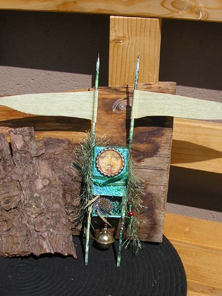
I actually made this last year, but it's typical of what is next on my list. I just have to clear my workbench from yesterday's project and pull together the necessary materials, most of which are very simple indeed: a matchbox, a couple of bamboo skewers, paper, paint, glue, bottle cap, and whatever else you have by way of gloss and glitter and other fancy stuff.

Challenge Materials - Kathy

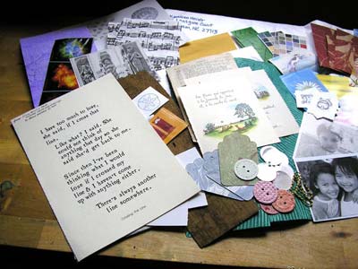
Kathy Heiser sent me these wonderful challenge materials the other day. It was such a delight to be able to spend part of what was a rainy Monday unpacking them and seeing what a variety of inspiring items the envelope held. There was a strip of bark, bible pages, paste paper, a lovely vintage card with children posing as angels, and so much more.

I've now spread the materials out in a quiet corner and am letting them suggest things to me. I can already "see" some of the items in combination with stuff from my existing stash. Let's wait and see what happens...

Monday, August 14, 2006

Lee's Journal

I had hoped to post this yesterday, but my middle daughter and I went off to a fish market in a nearby town, and by the time I got back home, Blogspot was on overload.

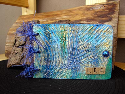
Sometime this week, a specific someone is going to read this post and feel rather pleased. I promised this to Lee a while ago, and now it's ready to be packed up and make the trip across the Atlantic.

The journal has gessoed covers on which I made a raised wave pattern with a tooth comb. I painted on ocean colours, as I know lee is fond of the shore, then I brushed the ridges with gold to add a bright contrast.

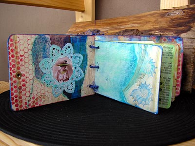
Inside, the pages were all colored (water soluble crayons and baby wipes) then edged with scraps of paper or ephemera. Other effects were made using a scrap of punchinella (sequin waste) as a mask and dabbing on chalk inks. I added a small corner pocket on the back inside page, as I love it when things stick out in journals.

One of the main ideas behind the journal is that it is not finished for once and for all. It can and should be added to, both in terms of embellishment and of additional pages to write on.

Friday, August 11, 2006

Dora's Box

Dora's box is the art side of the project I've been working on for the past couple of days for an upcoming RR in one of my art groups. The box is accompanied by a story prompt that tells why we meet the people who are most important to us in this lifetime and how those meetings are set up.

The box is a cardboard cigar box. I needed something light, because the project will travel across the Atlantic and back again as it runs its course.

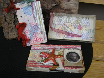
The red strips are corrugated paper covered with gesso and colored with chalk inks. The starfish is a plastic toy rubbed with gold Rub 'n Buff. The photo (Dora) is part of a cabinet card I printed out on transparency film, and the 3D frame is a scrap of foam core board covered in paper. The inside of the box is covered with scraps of old book pages, ledger, etc.

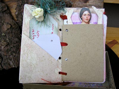
I then made a simple loose leaf journal to fit the box. The cover is card covered with wallpaper. I rubbed the covers with Ranger Distress Ink (Tattered Rose), to age them a little, and stamped seashells on top. I finished the covers off with a little of the corrugated edging, too.

The filling is a collection of loose sheets of watercolour paper (190g/m2) cut to size and pockets made of wallpaper scraps. The idea was to recreate the kind of thing a young girl would do with leftovers in an age in which children were not provided with off the shelf materials--an age in which no one had off the shelf art materials, in fact. The binding is simply torn strips of cheap red silk poked through five sets of holes. It's beautifully shabby, if I may say so. In fact, I think I'll make some more of these in large for myself.

One of the pockets contains a small articulated paper doll (not Dora) which is central to the story. You can just see her poking out.


Tuesday, August 08, 2006

Moments

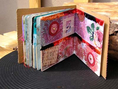
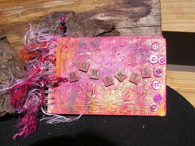
Sometimes, when the fancy takes me... A few days ago, someone said she'd like one of my albums. I just happened to be working on two other album covers at the time and had some extra cardboard cut to size, so I started work. It makes no difference really, whether I make two or three sets of covers at one time.

For the outside covers I laid down a layer of gesso and used a wooden skewer to scratch in a pattern of random lines. When it was dry, I gave the covers a wash of pink, making sure it got the colour down into all the gashes. Later I added a golden wash, which I worked into the lines over part of the cover and used to highlight the ridges on the other part. When that dried, I added tiny accents in orange, blue, and green.

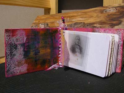
The inside covers are brighter and slightly more colourful, I dry brushed on all the colours I'd used on the front covers, but I did so mainly in layers, so there is some mixing, but not a lot. The brushstrokes are visible, and that was my intention. I glued on (matte medium) scraps of patterned cellulose for variety and brushed over them lightly with the main color to blend them in.

The journaling pages are cut from 190g/m2 watercolour paper and edged with scraps of vintage book pages and ledger. I've also included scraps pf paper and transparencies between pages. That leaves the recipient scope to add journaling and to embellish further, according to her taste and materials available to her.

That done, I finished the book by gluing on scrabble tiles (matte medium) and some dyed buttons (Ranger inks), then cut and tied short lengths of yarn and ribbon to the spine.

Sunday, August 06, 2006

Bodhi Doll

Another doll today. This one is called a "Bodhi doll". The word "bodhi" is a Buddhist term that is usually translated as "enlightenment" but also means "awakening" and "having insight into reality". The pursuit of bodhicitta -- the "enlightened heart" or "enlightened mind" is a central Buddhist practice. If you ask me, it's a central requirement of being aware in any spiritual or psychological practice.

The skeleton leaves are from the bodhi tree, a type of oriental fig tree that is often planted in Buddhist monasteries.

I've always felt an affinity to Buddhism, as have most of the people who were important to me in my adult life. So, while I wouldn't claim to be a Buddhist, my appreciation of Buddhist teachings reaches deep.

I'll be working more on this doll and others like it. I'll also be working on some kind of container or "shrine" in which the doll and a journal can be placed.

Two glossaries of Buddhist terms:

http://villa.lakes.com/cdpatton/Dharma/Canon/glossary.html
http://www.bodhipath-west.org/glossary.htm

Wednesday, August 02, 2006

Panorama Book

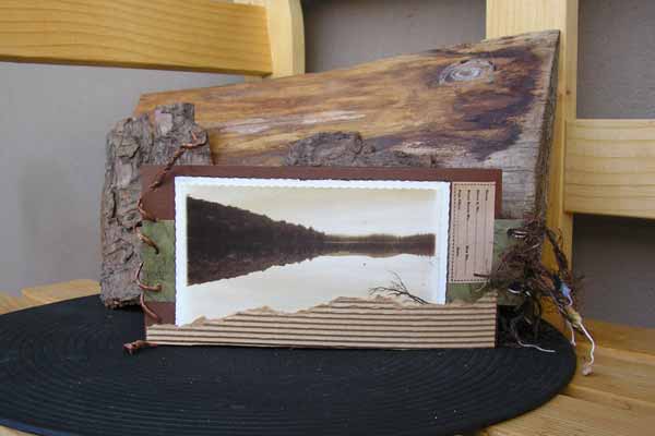
I've been working with challenge materials for the past few days. These are the materials I received from Margaret in Texas, USA. The idea is to use the materials (plus some from my stash) to make at least three items: one for the person who donated the materials, one for me, and one to give away as a RAK. I'll upload pictures of the things I've made over the next couple of days or so. first things first, though: I made this panorama book for Margaret.

Panorama books open Japanese style, from left to right (back to front). The image on the front cover is part of a postcards included in the materials. The image on the back is from an old school atlas. It shows Margaret's home country, the Netherlands.

Inside, the little book folds open to reveal a larger inner life than you might have suspected. The section on the left is layered and folded to create a 3-D effect. The sections on the right fold out and are intended as journaling space. The entire book is a travel journal of sorts, as this is what most of the materials suggested. The green background papers are also form Margaret's package.

My hope is that Margaret will use the journal to record some interesting trip or other by adding photos, mementos and journaling.

If desired, the holes on the far right of the journaling section can be matched to those on the cover edge and the decorative cord used to bind them together. That will make the open book stable enough to stand on a shelf.